 I have just had to present to a team on their information security responsibilities whilst they are on their current project. Their client has very specific requirements, and for a variety of reasons it was important to reinforce the key requirements again.
This was at short notice, and so I spent every spare moment I had throughout a long day last Thursday creating the presentation from scratch. After reviewing Master Services agreements, security schedules and other documents relating to the project I had to try and consolidate all of this into a meaningful presentation. I even Tweeted about my experience:

This is a battle hardened and very creatively talented team, working stupid hours and closing in on an important milestone of work. The last thing they wanted was to listen to the “corporate security guy” for twenty minutes, but for all the right reasons it was important that it was done today, and with the client present.
So I had: 1 – a disengaged audience, 2 – 24hrs notice, 3 – a client present, 4 – strong interest from HQ (“send us the presentation when you finish it so we can check it through” and finally, 5 – changes to be incorporated two hours beforehand (see 4).
Pop Quiz – do you use the corporate deck, smart and extensive bullet points, approved imagery and and a shirt and tie? Or do you focus on getting key message across, come what may?
And this is the crux of my point – the moment you try and deliver a corporate message in a corporate format your audience is going to switch off. One suggestion I received from a well meaning executive was to basically provide a list of the twenty requirements of the client in the presentation and then hand out copies to be signed by each team member. In this instance people would remember the first two, last two (at best!) and just blindly sign the rest. While this would technically meet the objectives (everyone must agree they understand the security requirements) they really wouldn’t absorb the message.
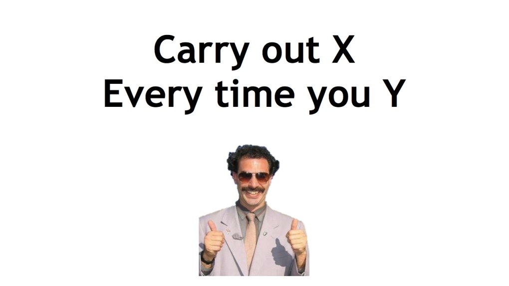
My approach? Simple, high impact and memorable. As the example below shows, not many words and a memorable picture (in the actual presentation Borat merged to Simon Cowell showing a thumbs down and back and forth). In this way, the image hits them first (thumbs up/thumbs down), the message (check X when doing Y), and that’s it! (The message has obviously been sanitised to protect the innocent).

Of course, there were many other slides along this nature – I also used references to The Oatmeal, Dilbert and Defcon 18 amongst others. And each slide put across a very specific point.
At first glance, the deck looks awful, plain and badly designed. However, the simplicity of it ensures the message very clearly comes across with the imagery ensuring that message remains memorable.
Three things came across very strongly at the end. Firstly, the questions and comments at the end were engaging, sensible and eminently relevant. This made me very confident that the message was put across and understood, and that this approach was the correct one in this circumstance.
Secondly, the client saw this engagement, and has since requested a copy of the presentation to demonstrate how the team had been successfully “trained” and and updated on security practices.
Finally, in front of this creative audience it became crushingly obvious that I really have to up my game when it comes to clip art…
 A short post to give the Wiltshire branch of the BCS a pointer to the slides from the presentation I gave last week on Tuesday 24th July in Swindon. It was an excellent evening, although I suspect the turnout was somewhat diminished by the weather!


